Scroll down to see the details
![]()
![]()
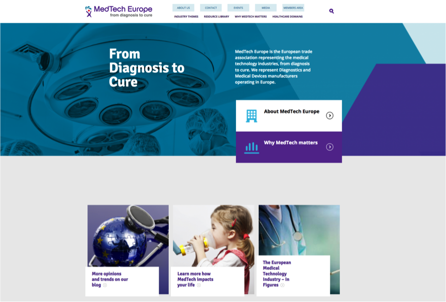
MedTech EUROPE
![]()
BACKGROUND
MedTech Europe is an alliance of European medical technology industry associations. It was founded in October 2012 and currently has two members: EDMA, representing the European in vitro diagnostic industry and Eucomed, representing the European medical devices industry.
THE CHALLENGE
Since its foundation, the two members of the Association were effectively ‘cohabiting’. A formal mariage was set for a vote in December 2016 by the thirty members of the MedTech Europe board. The positive outcome of the vote would see the need to present the new identity for the Association.
The challenge of this exercise was to capture the essence and culture of the two founding members in order to create a combined identity all would recognize and support, knowing that both members have very different cultures.
HOW DID WE APPROACH THE MISSION
We accompanied the management of MedTech Europe through the different phases of the Archestasis™ methodology. After working out the deeper identity of each member and clarifying how these distinctive cultures actually complement each other, the focus was put on translating the positioning strategy of the new MedTech Europe Association into a new brand identity, and a coherent communication ecosystem for the Association.
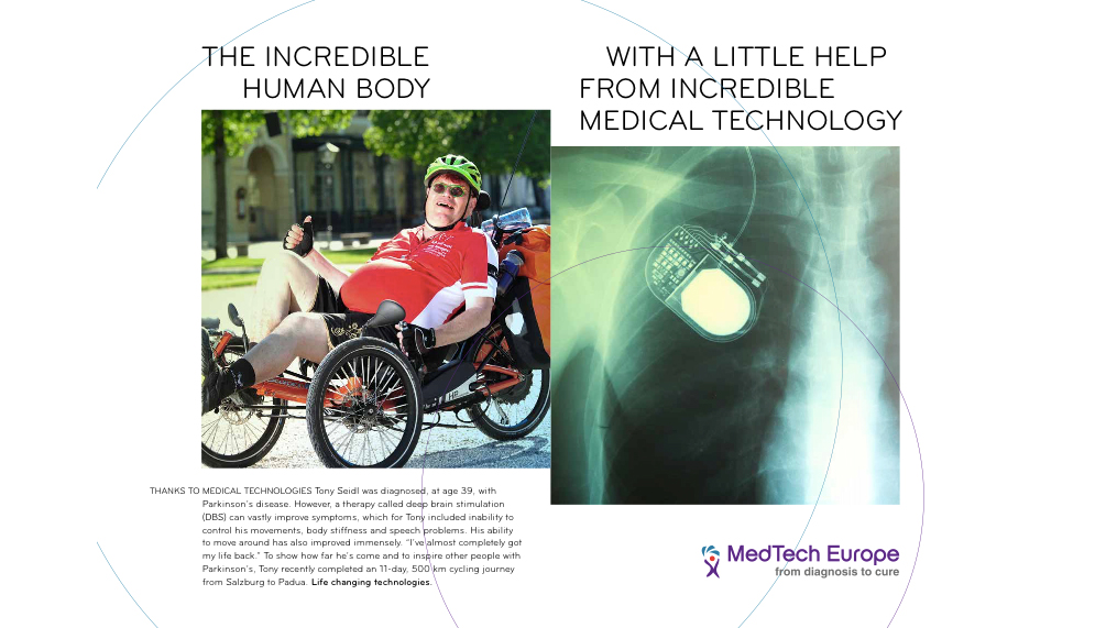
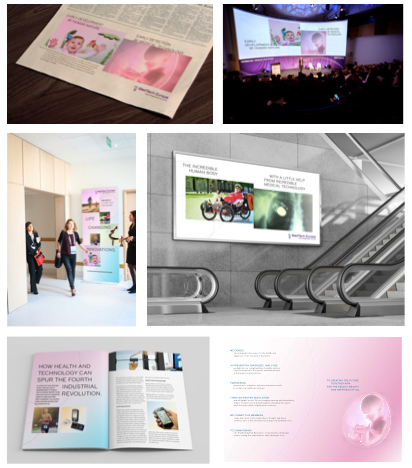
THE RESULT
The new identity was unanimously approved by the MedTech Europe Board and constitutes the foundation for the Association to meet three priority goals:
1.Ensure awareness building and understanding of the identity and role of the new MedTech Europe Association.
2.Ensure that the branding and visual identity are in line with the new identity of the Association.
3.Ensure smooth and clear communication to members and staff.
European Parliament
![]()
BACKGROUND
Europe’s institutions are facing an unprecedented crisis, and the European Parliament is also confronted to this predicament. The lack of involvement of Europe’s citizens in the European elections has prompted the European Parliament to take action in order to improve its image, to facilitate the education of the values and fundamental role it plays in maintaining democracy in Europe and the World, and facilitate interactions with the citizens it represents.
THE CHALLENGE
In recent years, the various Directorate Generals of the European Parliament took it upon themselves to develop their own projects and media channels, leading to an increasingly confused portfolio of brands and sub-brands.
The challenge was to to restructure and simplify the brand portfolio to create a much simplified brand architecture, while also laying the foundations for a more efficient and coherent communication strategy.
HOW DID WE APPROACH THE MISSION
We accompanied the DG Communication of the European Parliament on a two year mission to thoroughly review and up-date the visual and graphic identity of the European Parliament, as well as define its brand narrative and tone-of-voice. The first year was dedicated to crystallizing the deeper identity of the European Parliament with the Archestasis™ methodology. The following year was dedicated to translating the identity and positioning strategy into the new identity of the European Parliament.

THE RESULT
After being formally approved by the Secretary General of the European Parliament, the new identity was translated into a dedicated Brand Manifest and identity guidelines manual and are now gradually being implemented across the different Directorate General’s of the European parliament.
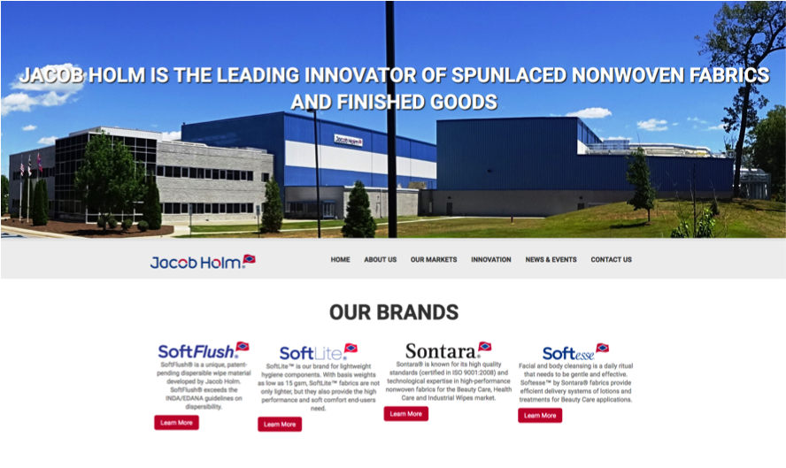
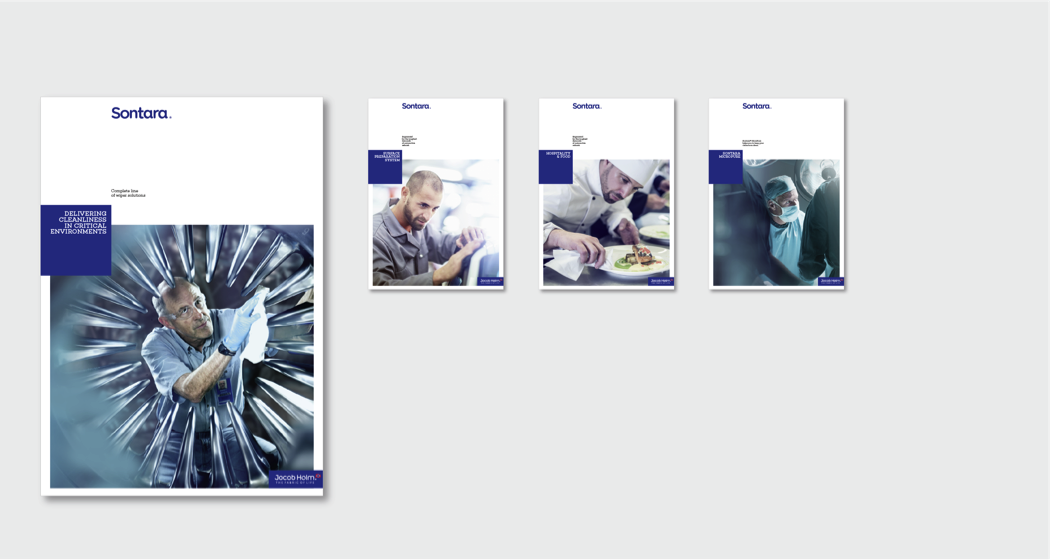
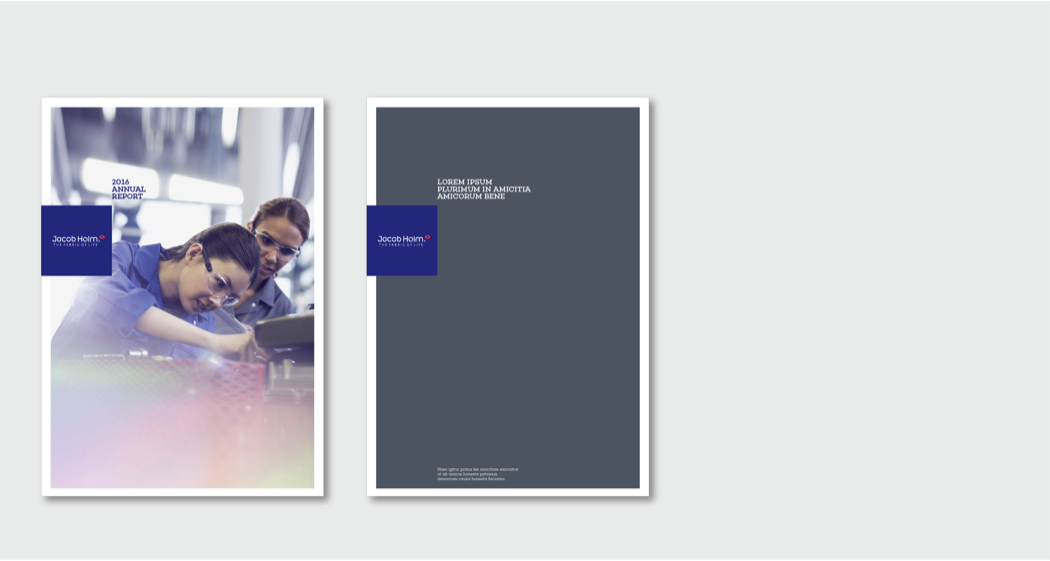
Jacob Holm
![]()
BACKGROUND
Founded in 1794 in Copenhagen, the Jacob Holm Group is a leading innovator of spunlace nonwoven fabrics and finished goods. It’s a unique family owned business with a 220 year heritage of entrepreneurship and innovation. Remarkably non-woven products have applications in practically every field, including numerous industrial applications, but also hygiene, beauty care and health care, but there is very little awareness of this.
THE CHALLENGE
In 2014 the Jacob Holm Group acquired Sontara®, the non-woven division of DuPont, to become the world leading innovator of spunlaced non-woven fabrics. This presented the company with two challenges: The first was to develop a common identity that would help bring together two very distinct company cultures in order to facilitate integration. The second was to develop a clear positioning and identity for the group that would do justice to its leading position in the industry.
HOW DID WE APPROACH THE MISSION
We accompanied Jacob Holm on an extensive brand identity journey to establish the common identity of the Group. The different phases of the Archestasis™ methodology were carried out over a two month period.
This process resulted in the identification of key themes and values that make up the DNA of the Group, as well as a deeper understanding of how Jacob Holm manages to be excellent at what it does. These essential elements of its identity were the cornerstones to creating a highly differentiating brand identity that also reflects the unique culture of this family owned business.
![]()
THE RESULT
The new Jacob Holm identity received a standing ovation at the annual Global Sales meeting that took place early in February 2017. By capturing the unique culture of the Group, the new identity has enriched the Group with genuine ‘sense-making’ energy and injected fresh impetus into the organization.
The new graphic and visual identity has been leveraged 360° into every aspect of Jacob Holm’s communication, including all its stationery, website, advertising material, extensive product literature, sampling material etc.
Dominice
![]()
BACKGROUND
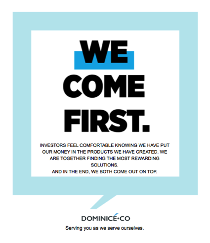
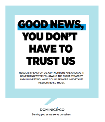
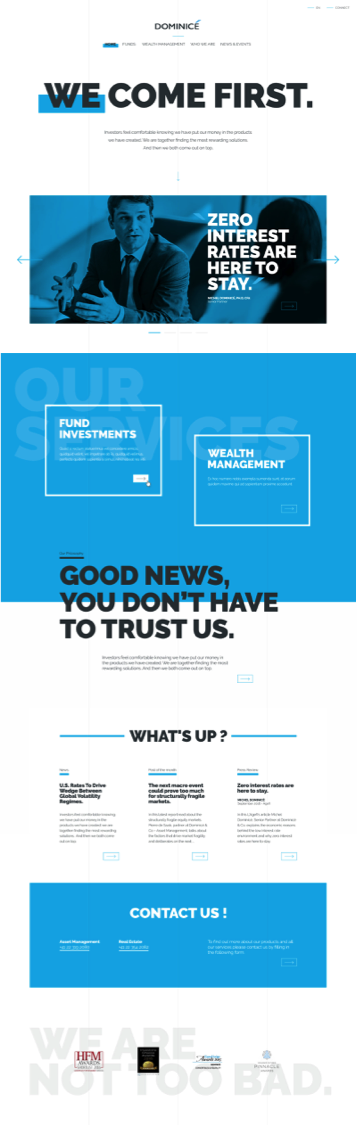
Dominicé is a Geneva-based hedge fund founded in 2004 by Michel Dominicé. Their returns are more than twice those of the average volatility fund. They achieve this by arbitraging the irrational behavior of Equity markets which tend to be focused on short-term risks despite being composed of long-term assets.
THE CHALLENGE
The Cassiopeia hedge fund – the brain child of Michel Dominicé, was the only volatility fund to make Barron’s 2011 top 100 Hedge Fund Survey, and Dominicé & Co have since been recognized as a leading Swiss Asset Manager.
With this success, Dominicé & Co were keen to redefine their positioning and communication strategy, and to develop an identity for the brand that would be highly differentiating in the industry while also strongly reflecting the unique philosophy and ethics that characterize the company.
HOW DID WE APPROACH THE MISSION
In-depth interviews of the entire management staff were carried out. This process enabled the identification of three core values and five root themes that are a direct expression of the DNA of the company.
It also brought to the surface the organizing principle that connects Dominicé & Co to its deeper identity.
THE RESULT
On the basis of the established positioning and strategy, a highly original and differentiating communication platform was elaborated for Dominicé, which also led to the development of a complete brand identity charter (Brand Manifest) defining the brand’s visual identity and tone-of-voice.
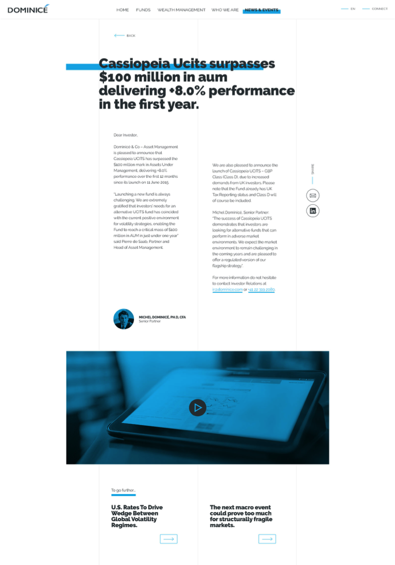
The strategy has also been leveraged into an integrated communication ecosystem including acquisition tactics.
Medirect
![]()
BACKGROUND
Mediterranean Bank has had a successful track record in Malta, where it built-up a substantial customer base over a short period of time by providing competitive savings, investment and wealth management products and services. Thanks to this success, the Bank decided to embark on a gradual expansion across Europe, with Belgium as its first ‘foothold’.
THE CHALLENGE
Archestasis® was selected to help position Mediterranean Bank in a highly competitive local market. The challenge was not only to develop a differentiating positioning and communication strategy, but also to put the foundations in place from day one for an effective acquisition strategy. Indeed, Mediterranean Bank had no customer base in Belgium and needed to build it from scratch.
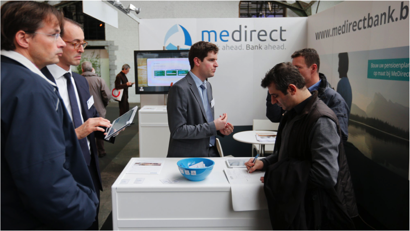
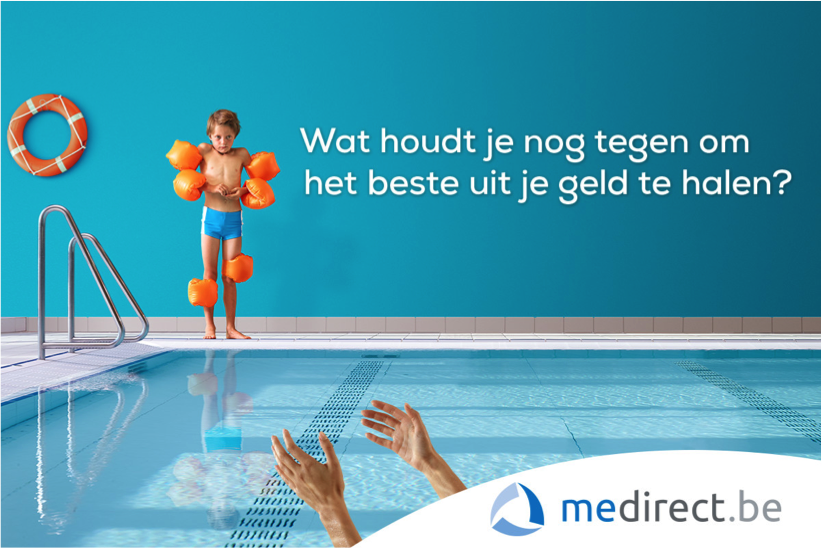
WHAT DID WE CARRY OUT
We carried out a thorough review of the banking sector in Belgium. It also carried out an in-depth analysis of changing consumer needs with respect to savings, investment and wealth management, and analyzed these findings against broader socio-cultural trends.
This in-depth analysis constituted the foundation for the positioning strategy and re-branding of Mediterranean Bank to Medirect.
Archestasis® designed a complete new identity for the brand and developed an integrated communication and acquisition strategy to ensure the successful launch of the brand. Medirect was profitable seven months after its launch, and acquired 21.000 new customers.
Sofina
![]()
BACKGROUND
SOFINA is a European, family-controlled, investment company listed on Euronext Brussels. It’s investment philosophy has always been based On long-term partnerships with leading funds, with a focus on venture and expansion capital.
THE CHALLENGE
SOFINA has grown to become a respected – albeit very discreet top-tier player in this sector. Prompted by an increasingly competitive global market, SOFINA decided late in 2015 to embark on a strategy to increase awareness for its brand, and more clearly communicate its unique market positioning.
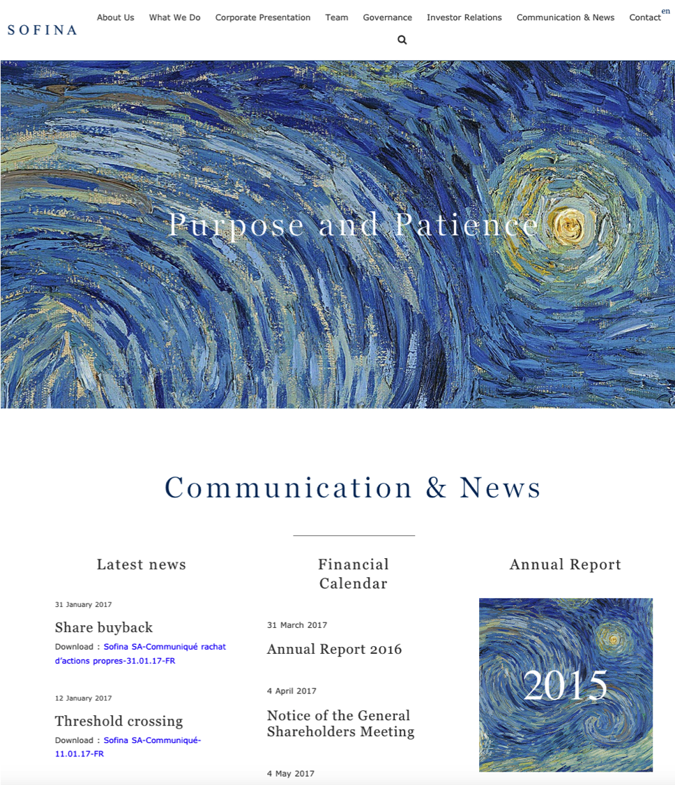
THE PROCESS
We carried out a substantive number of qualitative interviews with members of the Board and employees at different levels of the organization. This exercise helped us gather the indispensable insights needed to model the deeper identity of SOFINA.
It’s on this basis that the positioning and communication strategy for SOFINA was elaborated, and a thoroughly new visual identity was developed and consolidated in a dedicated brand charter.
We have since worked out the communication eco-system of the brand to streamline the MarCom activities of the brand globally.
B&C
![]()
BACKGROUND
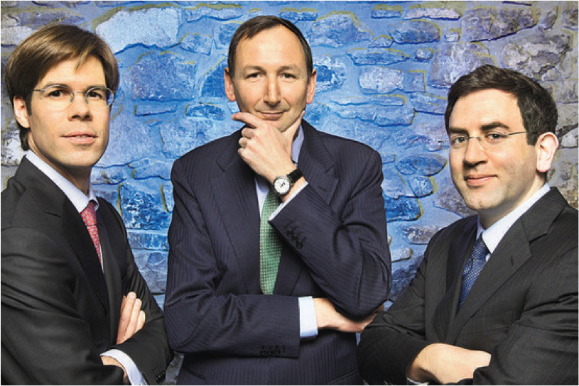
B&C – formerly known as Ocean Capital Associates LLP, is a modern day “merchant bank”, whose expertise is centered in providing loans to enterprises with long term views access to improve their capital position.
Ocean Capital is a privately owned and family backed business. Pedro Errazuriz (CEO) and Edouard Bridel (Chairman) founded Ocean Capital in 2002. They brought together their significant prior experience in structured finance and investment banking to serve medium and large enterprises.
THE CHALLENGE
Ocean Capital was a virtually unknown niche player in the industry. Archestasis® was handed the task of defining a competitive positioning strategy for the brand based on the unique vision and ethics of its founders. Archestasis® was also asked to carry out a complete re-branding of Ocean Capital, including the development of a new brand name, graphic identity and framework for the brand’s tone-of-voice.
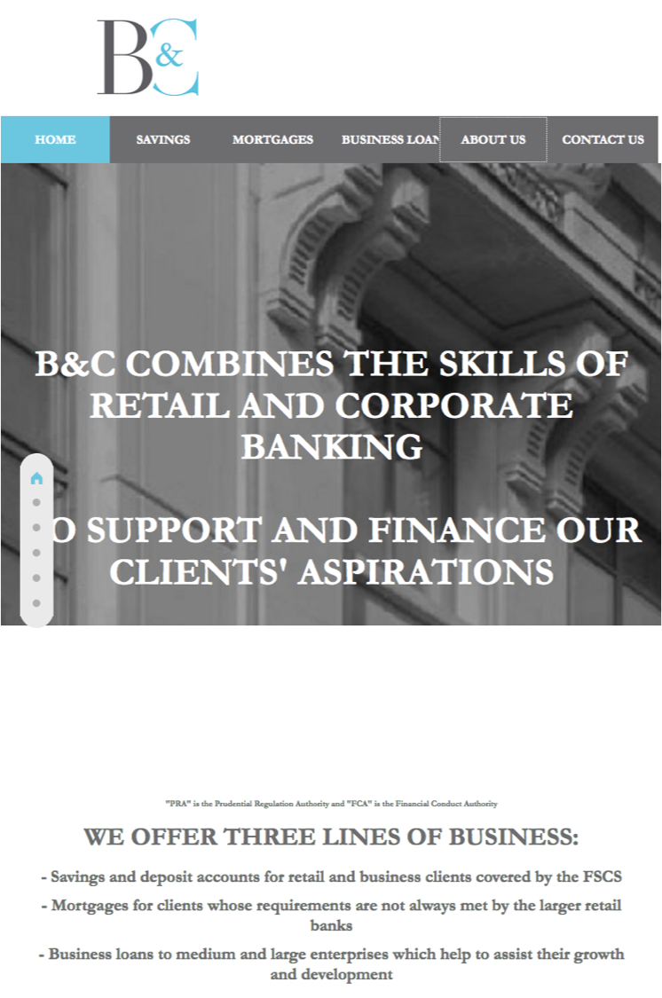
WHAT DID WE CARRY OUT
We carried out in-depth interviews of Ocean Capital staff based on the Archestasis® methodology. The resulting insights were leveraged to crystallize a positioning strategy fully in line with the values, ethos and long-term vision of the founding partners. Ocean Capital was re-branded to B&C and a detailed brand charter developed to guide all future communication initiatives. A specific track was kicked-off to develop the digital and communication strategy of the brand in a coherent and fully integrated communication eco-system.